This is the third post in a series about geomagnetic storms as a global catastrophic risk. A paper covering the material in this series was just released.
My last post examined the strength of certain major geomagnetic storms that occurred before the advent of the modern electrical grid, as well as a solar event in 2012 that could have caused a major storm on earth if it had happened a few weeks earlier or later. I concluded that the observed worst cases over the last 150+ years are probably not more than twice as intense as the major storms that have happened since modern grids were built, notably in 1982, 1989, and 2003.
But that analysis was in a sense informal. Using a branch of statistics called Extreme Value Theory (EVT), we can look more systematically at what the historical record tells us about the future. The method is not magic – it cannot reliably divine the scale of a 1000-year storm from 10 years of data – but through the familiar language of probability and confidence intervals it can discipline extrapolations with appropriate doses of uncertainty. This post brings EVT to geomagnetic storms.
For intuition about EVT, consider the storm-time disturbance (Dst) index introduced in the last post, which represents the average depression in the magnetic field at the surface of the earth at low latitudes. You can download the Dst for every hour since 1957: half a million data points and counting. I took this data set, split it randomly into some 5,000 groups of 100 data points, averaged each group, and then graphed the results. Knowing nothing about the distribution of hourly Dst – does it follow a bell curve, or have two humps, or drop sharply below some threshold, or a have long left tail? – I was nevertheless confident that the averages of random groups of 100 values would approximate a bell curve. A cornerstone of statistics, the Central Limit Theorem, says this will happen. Whenever you hear a pollster quote margins of error, she is banking on the Central Limit Theorem.
It looks like my confidence was rewarded:
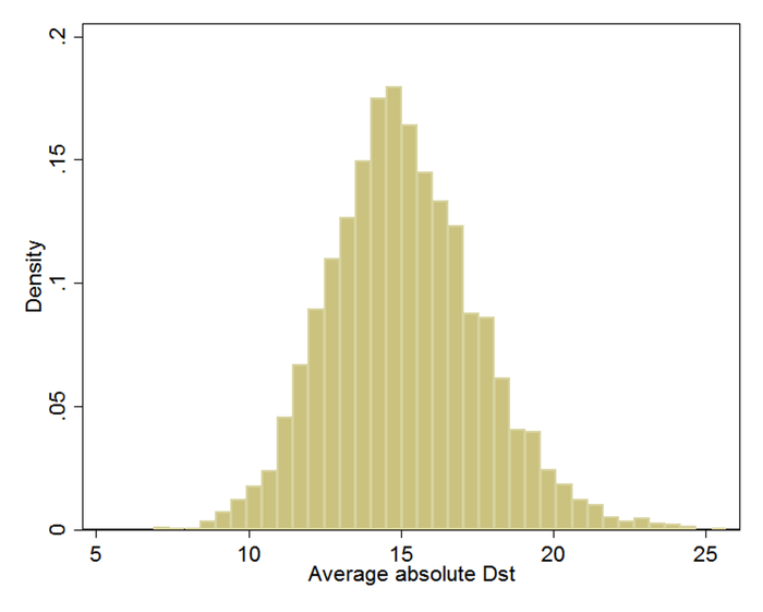
(Dst is usually negative. Here, I’ve negated all values so the rightmost values indicate the largest magnetic disturbances. I’ll retain this convention.)
Bell curves vary in their center and their spread. This one can be characterized as being centered at 15 nanotesla (nT) and having about 95% of its area between 10 and 20. In a formal analysis, I would find the center and spread values (mean and variance) for the bell curve that best fit the data. I could then precisely calculate the fraction of the time when, according to the perfect bell curve that best fits the data, the average of 100 randomly chosen Dst readings is between, say, 15 and 20 nT.
What the Central Limit Theorem does for averages, Extreme Value Theory does for extremes, such as 100-year geomagnetic storms and 1000-year floods. For example, if I had taken the maximum of each random group of 100 data points rather than the average, EVT tells me that the distribution would have followed a particular mathematical form, called Generalized Extreme Value. It is rather like the bell curve but possibly skewed left or right. I could find the curve in this family that best fits the data, then trace it toward infinity to estimate, for example, the odds of the biggest out of a 100 randomly chosen Dst readings exceeding 589; that was the level of the 1989 storm that caused the Québec blackout.
EVT can also speak directly to how fast the tails of distributions decay toward zero. For example, in the graph above, the left and right tails of the approximate curve both decay to zero. What matters for understanding the odds of extreme events is how fast the decline happens as one moves along the right tail. It turns out that as you move out along a tail, the remaining section of the tail normally comes to resemble to some member of another family of curves, called Generalized Pareto. The family embraces these possibilities:
- Finite upper bound. There is some hard maximum. For example, perhaps the physics of solar activity limit how strong storms can be.
- Exponential. Suppose we define a “storm” as any time Dst exceeds 100. If storms are exponentially distributed, it can happen that 50% of storms have Dst between 100 and 200, 25% between 200 and 300, 12.5% between 300 and 400, 6.25% between 400 and 500, and so on, halving the share for each 100-point rise in storm strength. The decay toward zero is rapid, but never complete. As a result, a storm of strength 5000 (in this artificial example) is possible but would be unexpected even over the lifetime of the sun. And it happens that the all-time average Dst would work out to 245.[1]
- Power law (Pareto). The power law differs subtly but importantly. If storms are power law distributed, it can happen that 50% of storms have Dst between 100 and 200, 25% between 200 and 400, 12.5% between 400 and 800, 6.25% between 800 and 1600, and so on, halving the share for each doubling of the range rather than each 100-point rise as before. Notice how the power law has a fatter tail than the exponential, assigning, for instance, more probability to storms above 400 (25% vs. 12.5%). In fact, in this power law example, the all-time average storm strength is infinite.
Having assured us that the extremes in the historical record almost always fall into one of these cases, or some mathematical blend thereof, EVT lets us search for the best fit within this family of distributions. With the best fit in hand, we can then estimate the chance per unit time of a storm that exceeds any given threshold. We can also compute confidence intervals, which, if wide, should prevent overconfident extrapolation.
In my full report, I review studies that use statistics to extrapolate from the historical record. Two use EVT (Tsubouchi and Omura 2007; Thomson, Dawson, and Reay 2011), and thus in my view are the best grounded in statistical theory. However, the study that has exercised the most influence outside of academia is Riley (2012), which estimates that “the probability of another Carrington event (based on Dst < -850 nT) occurring within the next decade is 12%.” 12% per decade is a lot, if the consequence would be catastrophe. “1 in 8 Chance of Catastrophic Solar Megastorm by 2020” blared a Wired headline. A few months after this dramatic finding hit the world, the July 2012 coronal mass ejection (CME) missed it, eventually generating additional press (see previous post). “The solar storm of 2012 that almost sent us back to a post-apocalyptic Stone Age” (extremetech.com).
However, I see two problems in the analysis behind the 12%/decade number. First, the analysis assumes that extreme geomagnetic storms obey the fat-tailed power law distribution, which automatically leads to higher probabilities for giant storms. It does not test this assumption.[2] Neither statistical theory, in the form of EVT, nor the state of knowledge in solar physics, assures that the power law governs geomagnetic extremes. The second problem is a lack of confidence intervals to convey the uncertainty.[3]
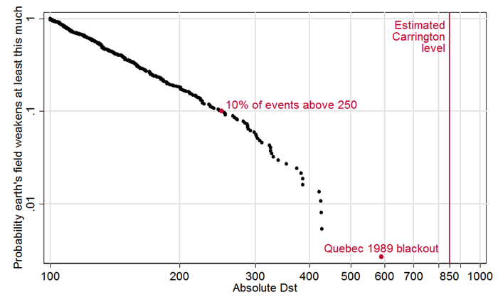
To illustrate and partially correct these problems, I ran my own analysis (and wrote an EVT Stata module to do it). Stata data and code are here. Copying the recipe of Tsubouchi and Omura (2007), I define a geomagnetic storm event as any observation above 100 nT, and I treat any such observations within 48 hours of each other as part of the same event.[4] This graph depicts the 373 resulting events. For each event, it plots the fraction of all events its size or larger, as a function of its strength. For example, we see that 10% (0.1) of storm events were above 250 nT, which I’ve highlighted with a red dot. The biggest event, the 1989 storm, also gets a red dot; and I added a line to show the estimated strength of the “Carrington event,” that superstorm of 1859:
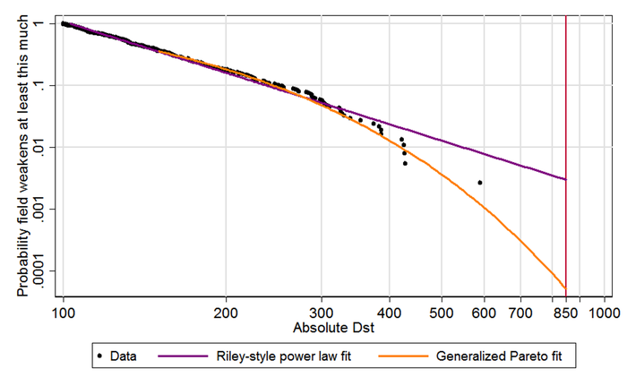
Below about 300, the data seem to follow a straight line. Since both axes of the graph are logarithmic (with .01, .1, 1 spaced equally) it works out that a straight line here does indicate power law behavior. However toward the right side, the contour seems to bend downward toward.
In the next graph, I add best-fit contours. Copying Riley, the purple line is fit to all events above 120; as just mentioned, straight lines correspond to power laws. Modeling the tail with the more flexible, conservative, and theoretically grounded Generalized Pareto distribution leads to the orange curve.[5] It better fits the biggest, most relevant storms (above 300) and when extended out to the Carrington level produces a far lower probability estimate:
Finally, I add 95% confidence intervals to both projections. Since these can include zero, I drop the logarithmic scaling of the vertical axis, which allows zero to appear at the bottom left. Then, for clarity, I zoom in on the rightmost data, for Dst 300 and up. Although the black dots in the new graph appear to be arranged differently, they are the same data points as those above 300 in the old graph:
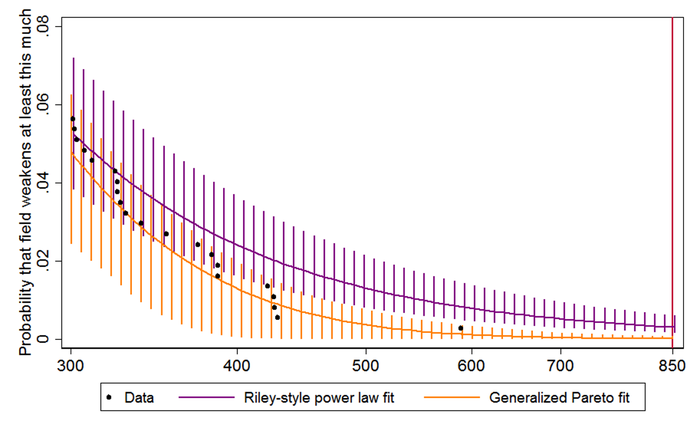
The Riley-style power law extrapolation, in purple, hits the red Carrington line at .00299559, which is to say, 0.3% of storms are Carrington-strength or worse. Since there were 373 storm events over some six decades (the data cover 1957–2014), this works out to a 17.6% chance per decade, which is in the same ballpark as Riley’s 12%. The 95% confidence interval is 9.4–31.8%/decade. In contrast, the best fit rooted in Extreme Value Theory, in orange, crosses the Carrington line at just .0000516, meaning each storm event has just a 0.005% chance of reaching that level. In per-decade terms, that is just 0.33%, with a confidence interval of 0.0–4.0%.[6]
The central estimate of 0.33%/decade does look a bit low. Notice that the rightmost dot above, for 1989, sits toward the high end of the orange bar marking the 95% confidence interval: my model views such a large event as mildly improbable over such a short time span. Moreover, if 0.33%/decade is the right number, then there was only about a 20×0.33% = 6.6% chance of Carrington-scale event in the 20 decades since the industrial revolution – and yet it happened. Nevertheless, the 95% confidence interval of of 0.0–4.0% easily embraces both big storms. I therefore feel comfortable in viewing Riley’s 12%/decade risk estimate as an unrepresentative extrapolation from history. The EVT-based estimate is better grounded in statistical theory and comes from a model that better fits the data. So are we in the clear on geomagnetic storms? As I wrote last time, I don’t think so. The historical record exploited here spans less than six decades, which is approximately nothing in the time scale of solar history. We should not assume we have seen most of what the sun can send our way. There are many limitations in this analysis. As noted in the last post, the Dst index is an imperfect proxy for the degree of rapid magnetic change at high latitudes that may most threaten grids. Though a careful estimate, 850 might be the wrong value for the Carrington event.
And the higher end of the confidence interval, 4%, is worth worrying about if another Carrington could mean a long-term, wide-scale blackout.